
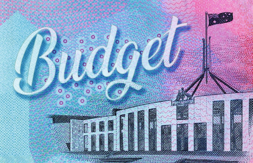
Tuesday, 12 May 2026, at roughly 7:30 pm AEST, Treasurer Jim Chalmers will stand up in Canberra and deliver the 2026-27 Federal Budget. According to Budget.gov.au, that is when the Budget is officially released, with the Budget papers going live online at the same time.
But this is not just another Budget night.
The Treasurer is putting together a fiscal plan while rates are moving higher, not lower. That is what makes this one feel different. The Reserve Bank of Australia (RBA) lifted the cash rate to 4.35 per cent on 5 May, its third straight hike this year, in an 8 to 1 vote.
That is the part Australian market participants may not want to overlook.
Budget basics in plain English
The Federal Budget is basically the government’s plan for the year ahead. It sets out how much it expects to spend, tax and borrow, along with its forecasts for growth and inflation.
Markets usually care less about the big speech and more about the details buried in the papers. Think deficits, debt issuance, inflation assumptions, household relief, infrastructure spending and sector-specific surprises.
The Treasurer has already flagged a productivity package and a savings package. The Prime Minister has also shifted the broader message towards ‘national resilience’.
Those phrases may sound political, but they can matter for markets once the numbers are released.
The 2026–27 Budget catalyst watchlist
Budget night scenarios
None of these are predictions, rather they are frameworks for thinking about how markets may initially react once the Budget papers are released.
A short pre-budget checklist
Where it can go wrong
The Budget rarely writes the whole script. In fact, some measures may already be priced in. Offshore moves can dominate, details may be revised in coming weeks, and the RBA’s June meeting may matter more than any single line item.
Sector winners can still fall if valuations are stretched and the next inflation print may also overwrite the night’s narrative.
Takeaway
For newer Australian market participants, the key point is this: the Budget is a catalyst, not a crystal ball and the job is not to guess every measure. It is to watch how the Budget shifts expectations for rates, inflation, government borrowing, household income and company earnings.
That is the chain that moves prices, often well after the speech is over.
Join us on Wednesday morning for GO's reeaction and what it means for the Aussie dollar, the ASX and your trading.

Reportingdates and release times are based on company investor relations calendars whereconfirmed. Where dates or times are not marked confirmed, they are GO Marketsestimates. Consensus EPS, revenue and analyst-range data are sourced fromBloomberg and Earnings Whispers, as at 09 July 2026 (AEST). Company guidance,backlog and operating metrics are sourced from the latest company filings orresults presentations, unless stated otherwise. Any scenario analysis reflectsGO Markets analysis. Figures and schedules may change without notice.
The information provided is of general nature only and does not take into account your personal objectives, financial situations or needs. Before acting on any information provided, you should consider whether the information is suitable for you and your personal circumstances and if necessary, seek appropriate professional advice. All opinions, conclusions, forecasts or recommendations are reasonably held at the time of compilation but are subject to change without notice. Past performance is not an indication of future performance. Go Markets Pty Ltd, ABN 85 081 864 039, AFSL 254963 is a CFD issuer, and trading carries significant risks and is not suitable for everyone. You do not own or have any interest in the rights to the underlying assets. You should consider the appropriateness by reviewing our TMD, FSG, PDS and other CFD legal documents to ensure you understand the risks before you invest in CFDs. These documents are available here.
Any references to Australian or international shares, sectors, indices, ETFs, crypto-related stocks or other instruments are provided for market commentary and watchlist purposes only and do not constitute a recommendation, offer or solicitation to buy, sell or hold any financial product or adopt any investment strategy. International markets may involve additional risks, including currency fluctuations, regulatory differences, market structure differences, reduced liquidity and higher volatility. Company-specific, sector-specific and macroeconomic risks may also affect performance.
Commentary on geopolitical developments, economic data, central bank decisions, earnings, policy changes and other global or financial market events is based on information available at the time of publication and may change without notice. Such events can lead to sudden market moves, price gaps, reduced liquidity, wider spreads and increased volatility, particularly in leveraged products such as CFDs. Forward-looking statements, expectations and scenario analysis are inherently uncertain and should not be relied on as guarantees of future market behaviour or outcomes.


.jpeg)


