

澳大利亚证券交易所国防股重返更多关注名单,根据斯德哥尔摩国际和平研究所(SIPRI)的数据,2024年全球军费开支达到约2.718万亿美元,按实际价值计算增长9.4%。
澳大利亚目前的国防环境载于2024年国防战略和相关的投资规划文件,这些文件概述了长期能力融资的优先事项。此外,堪培拉指出,到2034年,将有3300亿澳元的能力投资,包括为水面作战人员、备战、远程打击和自主系统增加资金。
这是大多数人错过的部分:并非所有的澳大利亚证券交易所国防股票都是一样的交易。有些位于海军造船厂附近。有些是反无人机的名称,有些是规模较小、风险较高的运营商,其中一份合约可能比市场假设的要重要得多。
澳大利亚交易者现在正在问的5个波动性问题
这五个名字不是买入清单,相反,对于试图了解澳大利亚证券交易所实际采购势头可能出现在何处的投资者来说,它们是一个实用的观察清单。
1) Austal (ASX: ASB)
尽管合同执行、利润率和交付时间仍然是重要的变量,但Austal是最直接受澳大利亚海军造船管道影响的澳交所上市公司之一。
他们不只是随机赢得合同;他们签署了一项大规模的法律协议(战略造船协议),这使他们成为在西澳大利亚建造澳大利亚下一代中型军舰的官方合作伙伴。
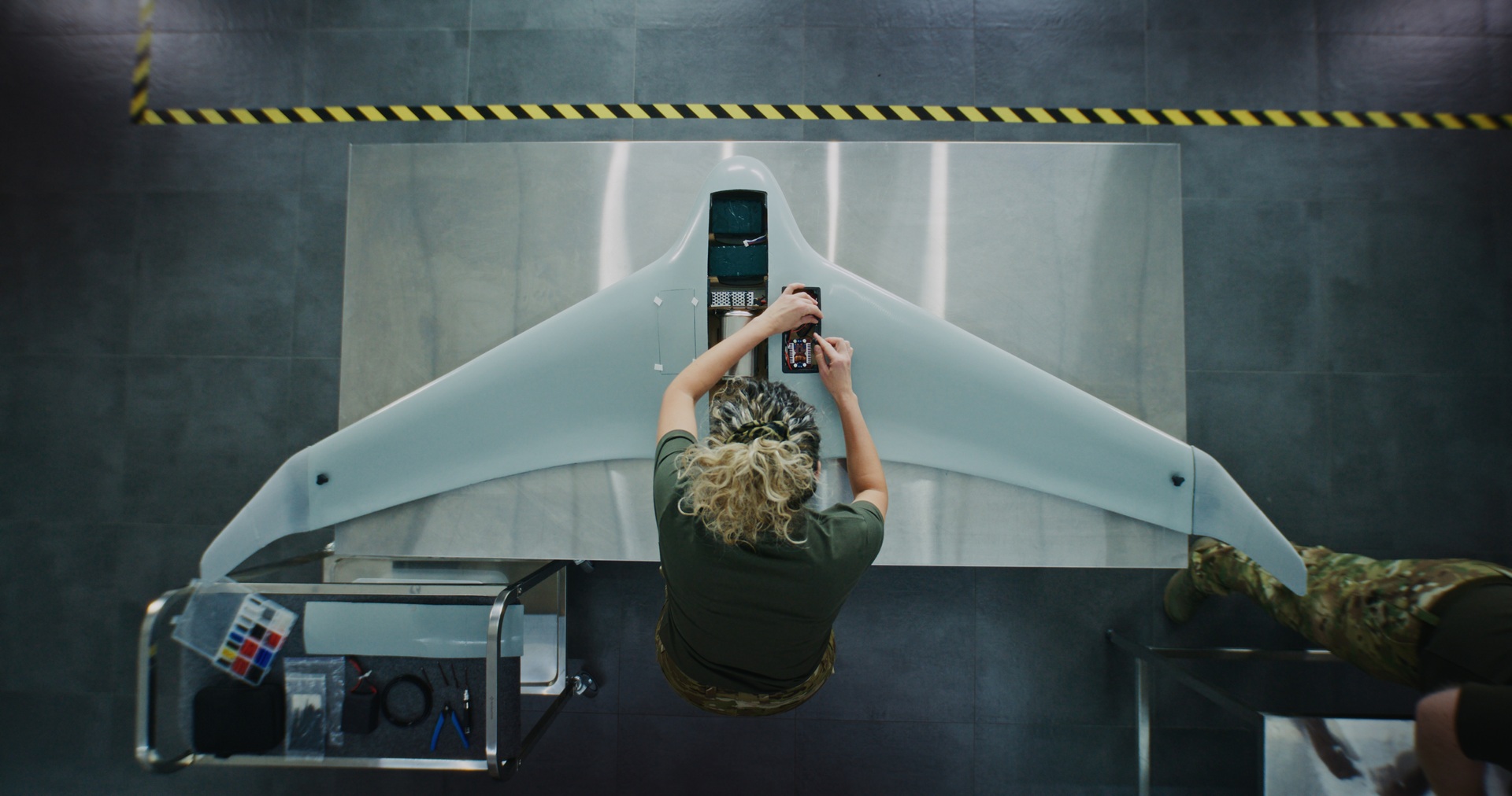
2026年2月,政府为奥斯塔尔一项耗资40亿美元的项目开了绿灯。这不仅适用于一艘飞船,还适用于8艘重型登陆艇。这些是大型运输船(长约100米),旨在将重型坦克和装备直接运送到海滩上。但这是大多数人错过的部分,造船是一场马拉松,不是短跑。
正如你在交付时间表中看到的那样,虽然施工于2026年开始,但最后一艘船要到2038年才能交付。对于投资者来说,这意味着Austal在未来12年中拥有 “有保障” 的收入来源,但他们必须非常擅长在这段时间内管理成本才能真正获利。
2) DroneShield (ASX: DRO)
如果你看过小型无人机扰乱现代战场的镜头,那么 DroneShield 正在建造 “关闭开关” 的一部分。其重点是反无人机技术,包括使用电子战、传感器和软件主导的工具来检测、破坏或击败无人机的系统,而不仅仅依赖传统弹药。
到2026年初,DroneShield已经摆脱了前景光明的初创公司的标签,进入了更大的商业阶段。该公司报告称,FY2025 收入为2.165亿澳元,比 FY2024 增长276%,并表示其在 FY2026 之初的承诺收入为1.035亿澳元。
市场可能忽略的一点是模型中的软件层。DroneShield报告称,FY2025 的软件即服务(SaaS)收入为1160万澳元,并表示正在努力使SaaS在五年内占收入的30%。其订阅模式包括已部署系统的软件更新,除了硬件销售外,还增加了不断增长的经常性收入。
在澳大利亚证券交易所的国防股票中,DroneShield是遵循反美国主题的最直接方式之一。它也是市场情绪可以快速波动的名字之一,因为当订单时机发生变化时,增长故事可以向上和向下重新评级。
值得关注的国防股:伊朗战争的赢家和输家
3) 电子光学系统 (ASX: EOS)
EOS 为军事平台构建 “大脑” 和 “肌肉”。它最出名的是远程武器系统,允许操作员从防护车辆内部控制武装炮塔,以及用于反无人机防御的高能激光系统。EOS表示,在2025年之前赢得了一系列合同之后,其无条件的积压订单在2026年初达到约4.591亿澳元。尽管交付时间和收入转换仍然很重要,但这表明安全工作的基础要大得多。
EOS与一家欧洲客户签署了7140万欧元(约合1.25亿澳元)的合同,购买一套100千瓦的高能激光武器系统。EOS表示,该系统旨在降低每次射击的成本,每分钟最多可以与20架无人机交战。澳大利亚政府已在10年内拨出13亿澳元用于反无人机能力的收购,EOS透露它是成功的LAND 156竞标小组的一员。这并不能保证未来的收入,但确实支持了该公司已经瞄准的市场的中期知名度。
EOS 读起来是一个反弹故事,但仍然取决于执行力。该公司已围绕远程武器系统、反无人机系统和激光器调整了方向,所有这些领域都与增加国防开支有关。关键问题是,它能否在保持资产负债表纪律的同时,继续将待办事项和渠道转化为已交付的收入。
4) Codan(澳大利亚证券交易所股票代码:CDA)
Codan有时会被排除在临时国防股票清单之外,因为它更加多样化。这可能是一个疏忽。Codan在其26财年上半年的业绩中表示,其通信业务为全球军事和公共安全市场设计关键任务通信。通信收入增长了19%,达到2.218亿澳元。该公司还表示,DTC实现了国防和无人系统需求的强劲增长,无人系统收入增长了68%,达到7300万澳元。科丹说,无人驾驶收入中约有一半与冲突地区的作战国防应用有关。
这就是故事变得更加细致入微的地方。在澳大利亚证券交易所的一揽子国防股票中,Codan可能提供不同的概况,不那么纯粹的标题敏感度,更广泛的业务多元化,对军事通信和无人系统的投资有意义,但不是一个单一主题的名称。这种多元化也可能意味着股票的交易并不总是像纯粹的防御名字。
油价上涨对埃克森、雪佛龙和伍德赛德可能意味着什么
5) HighCom(澳大利亚证券交易所股票代码:HCL)
HighCom在这份清单中处于推测性的一端,应该这样给它贴上标签。该公司表示,其两项持续业务是提供弹道防护的HighCom Armor和HighCom Technology,该公司为澳大利亚国防军和其他结盟的地区军队提供和维护中小型无人驾驶航空系统、反无人驾驶航空系统以及相关的工程、集成、维护和后勤支持。
在26财年上半年,持续经营业务收入下降了59%,至1,090万澳元,而息税折旧摊销前利润从去年同期的190万澳元利润转为亏损540万澳元。HighCom还披露了HighCom Technology的510万澳元收入,其中包括来自小型无人驾驶航空系统(SUAS)备件的350万澳元和来自向澳大利亚国防部提供的维持服务的160万澳元。
因此,是的,HighCom是董事会中财务敏感度最高的澳大利亚证券交易所国防股票之一。但是,它也是一个较小的名称,可以说明采购是如何渗透到支持、维持和专业防护装备的。
主要市场观察
- 追踪计划里程碑,而不仅仅是政治头条。合同授予、生产开工、交付时间表和维护工作通常比单一的公告日更重要。
- 将纯粹的曝光与多样化的曝光分开。DroneShield和EOS更接近于集中的国防技术主题,而Codan则在更广泛的业务组合中带来了通信曝光度。
- 观看澳大利亚的主权能力主题。Austal和EOS与本地制造、整合和澳大利亚供应链息息相关,这为该集团更广泛的主权能力主题提供了支持。
- 注意资产负债表和现金转换。即使时机变得混乱,采购势头也可能是真实存在的。HighCom的最新半场让人想起了这一点。
全球波动和差价合约:地缘政治冲击后如何交易
风险和制约因素
国防头条新闻可以立竿见影。收入通常不是。奥斯塔尔的主要海军工作将持续到未来十年。EOS 合约的交付期为多年。DroneShield的订单流似乎强劲,但该公司仍将承诺收入与更广泛的渠道机会区分开来。HighCom展示了硬币的另一面。采购风险不会自动转化为顺利的财务执行。
提及在澳大利亚证券交易所上市的国防股票仅为一般信息,不建议买入、卖出或持有任何证券或差价合约。这些股票可能波动很大,对合约时机、政府政策、地缘政治、执行风险和市场状况很敏感。待办事项、渠道和收入预期并不能保证未来的业绩。
准备好在主要交易之外进行交易了吗?
开设一个账户 · 登录

Reportingdates and release times are based on company investor relations calendars whereconfirmed. Where dates or times are not marked confirmed, they are GO Marketsestimates. Consensus EPS, revenue and analyst-range data are sourced fromBloomberg and Earnings Whispers, as at 09 July 2026 (AEST). Company guidance,backlog and operating metrics are sourced from the latest company filings orresults presentations, unless stated otherwise. Any scenario analysis reflectsGO Markets analysis. Figures and schedules may change without notice.
The information provided is of general nature only and does not take into account your personal objectives, financial situations or needs. Before acting on any information provided, you should consider whether the information is suitable for you and your personal circumstances and if necessary, seek appropriate professional advice. All opinions, conclusions, forecasts or recommendations are reasonably held at the time of compilation but are subject to change without notice. Past performance is not an indication of future performance. Go Markets Pty Ltd, ABN 85 081 864 039, AFSL 254963 is a CFD issuer, and trading carries significant risks and is not suitable for everyone. You do not own or have any interest in the rights to the underlying assets. You should consider the appropriateness by reviewing our TMD, FSG, PDS and other CFD legal documents to ensure you understand the risks before you invest in CFDs.


.jpeg)


